[ad_1]
From unapologetically loud fuchsia pinks that command attention, to more demure muted pale pinks that provide a warmer alternative to neutral color schemes, there’s a pink paint color to suit all styles and tastes.
Pink paint colors are more sought after than ever before thanks to their versatility and range of tones. “Often considered a little too sweet for many rooms, pink has been traditionally used for children’s bedrooms, but in recent years pink has really found its way into every corner of the home,” explains Ruth Mottershead, Creative director Little Greene.
“You now see people incorporating its vast range – from gentle plaster and powder-like hues, to warm peachy tones and bright statement pinks – within their design schemes.” Pale pink has even become the go-to for alternative ceiling color ideas.
Whether you’re contemplating a muted pink to update your living room paint color or exploring the latest interior paint color trends for a bold new season color, we’re on hand to inspire your selection with our curation of the best pink paint colors as recommended by color experts and interior designers for your home.
On-trend pink paint colors loved by industry experts
When using pink, as with any color that offers a depth of shade, it’s important to consider the undertones and the light aspect of the room you’re decorating, as this will determine if the shade of pink you’re considering will look warm or cool.
“In terms of warmth, all pinks are inherently warm since the yellow/orange/red side of the color wheel is warm and the blue/green side is cool” explains Benjamin Moore (opens in new tab)‘s Helen Shaw. “However, I would also say that cleaner colors feel cooler than more muted ones.”
1. First Light by Benjamin Moore

(Image credit: Benjamin Moore)
This soft pink is currently the best-selling pink at Benjamin Moore, unsurprisingly perhaps because it was their Color of the Year 2020.
“First Light, a soft, airy pink that flatters any space, is a refreshing alternative to white or beige” suggests Helen. “It’s clean and uplifting, and very feminine, so has proved a popular choice in bedrooms and relaxed living areas. First Light works well with a variety of shades of white, as well as stronger colors including Hint of Mauve; Mississippi Mud, and Northwood Brown.”
View First Light Regal Matt Emulsion at Benjamin Moore (opens in new tab).
2. Potters Pink by Dulux
(Image credit: Dulux)
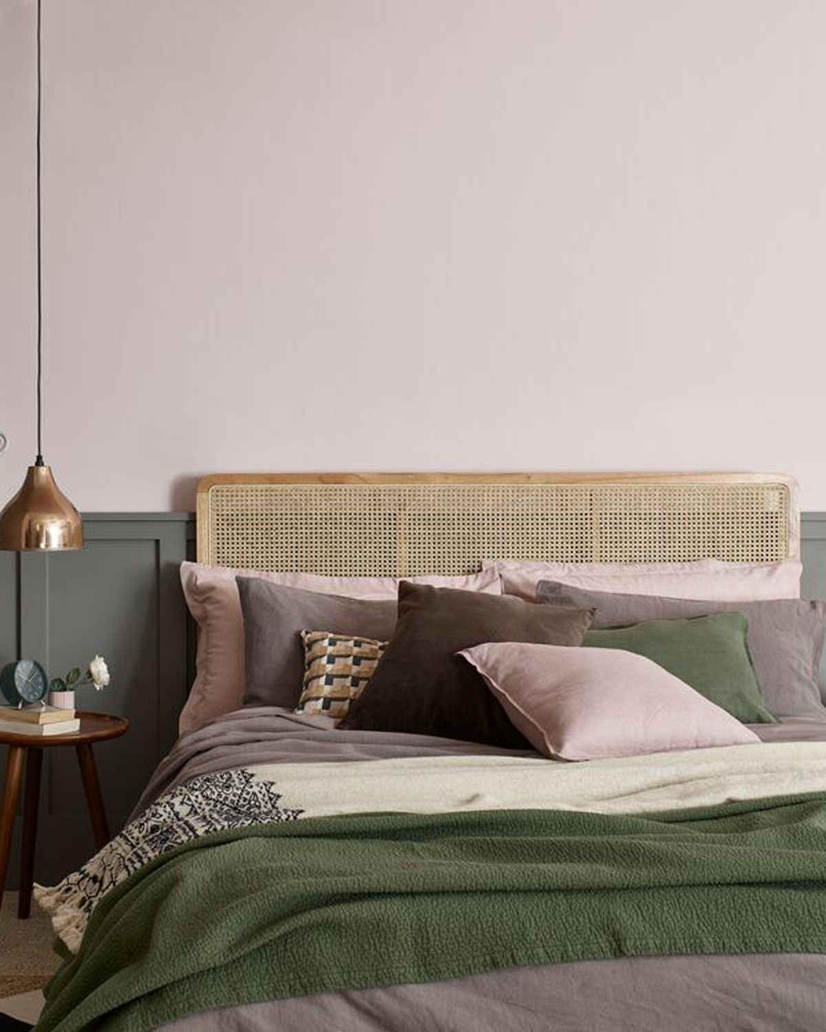
“Potters Pink is my ‘go-to’ pink for every room,” says Marianne Shillingford (opens in new tab), Creative Director at Dulux. “It’s deliciously gentle, adds just the right amount of sweetness, and never overwhelms other colors it’s teamed with. This hidden gem of the interior designer’s palette seems to work effortlessly with all other colors too, especially greens like Olive Tree and Waxed Khaki.”
On where it’s best to use this soft shade of pink, Marianne recommends: “It warms up north-facing rooms and enhances the cozy feeling in south-facing rooms. Plus it looks amazing with dark wood (a key flooring trend for 2023) and a touch of gold. If you like your pinks understated, elegant, and easy to live with, this is definitely the shade for you.”
View Potter Pink Heritage Matt Emulsion by Dulux at Homebase (opens in new tab).
3. Cinder Rose by Farrow & Ball
(Image credit: Farrow & Ball)
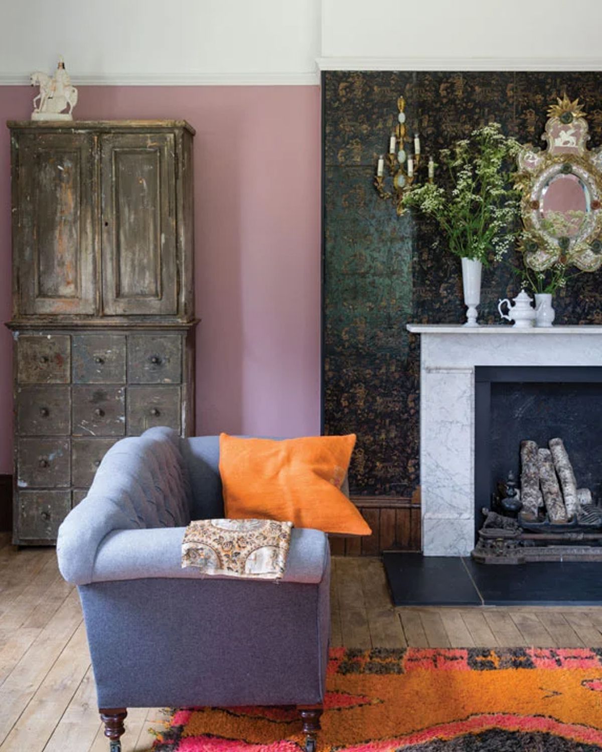
“Cinder Rose is a gorgeous color as it is somewhat like a Chameleon, irrespective of the light or the positioning, the color adapts, and the darker the space the moodier the color gets and in lighter rooms, the color comes alive, and gives off a vibrant and fun feeling,” explains award-winning interior designer Rudolph Diesel (opens in new tab).
“Cinder Rose is for those who adore pinks but do not want it to be too intense, this elegant color is perfect for a feature wall in a powder room or a children’s playroom. It is versatile and works well with other colors like black, Great White, Middleton Pink, Skimming Stone, and Dove Tail to name a few.”
4. Masquerade by Little Greene
(Image credit: Little Greene)
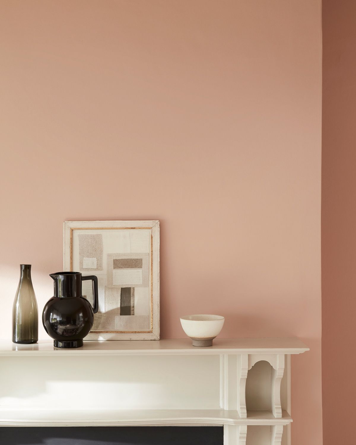
Sharing an insight into the best-selling Little Greene pink paint color Ruth tells woman&home, “The grown-up pink, ‘Masquerade’ is both calming and joyful. With its delicate, powder-like hue, Masquerade offers an alluring, natural undertone that is as ‘at home’ in the bedroom as it is in the ballroom.”
“Offered alongside ‘Masquerade Light’ and ‘Masquerade Mid’; these Colour Scales of the earth-pink ‘Masquerade’ offer graduated tones, made using the same pigments, but in different strengths, allowing for the creation of a harmonious design scheme that provides movement within a space. They are easy to use in combination on walls, ceiling, and trim as well as providing a seamless color journey from room to room.”
View Masquerade Absolute Matt Emulsion by Little Greene at Designer Paint (opens in new tab).
5. Ballet Slippers by Benjamin Moore
(Image credit: Benjamin Moore)
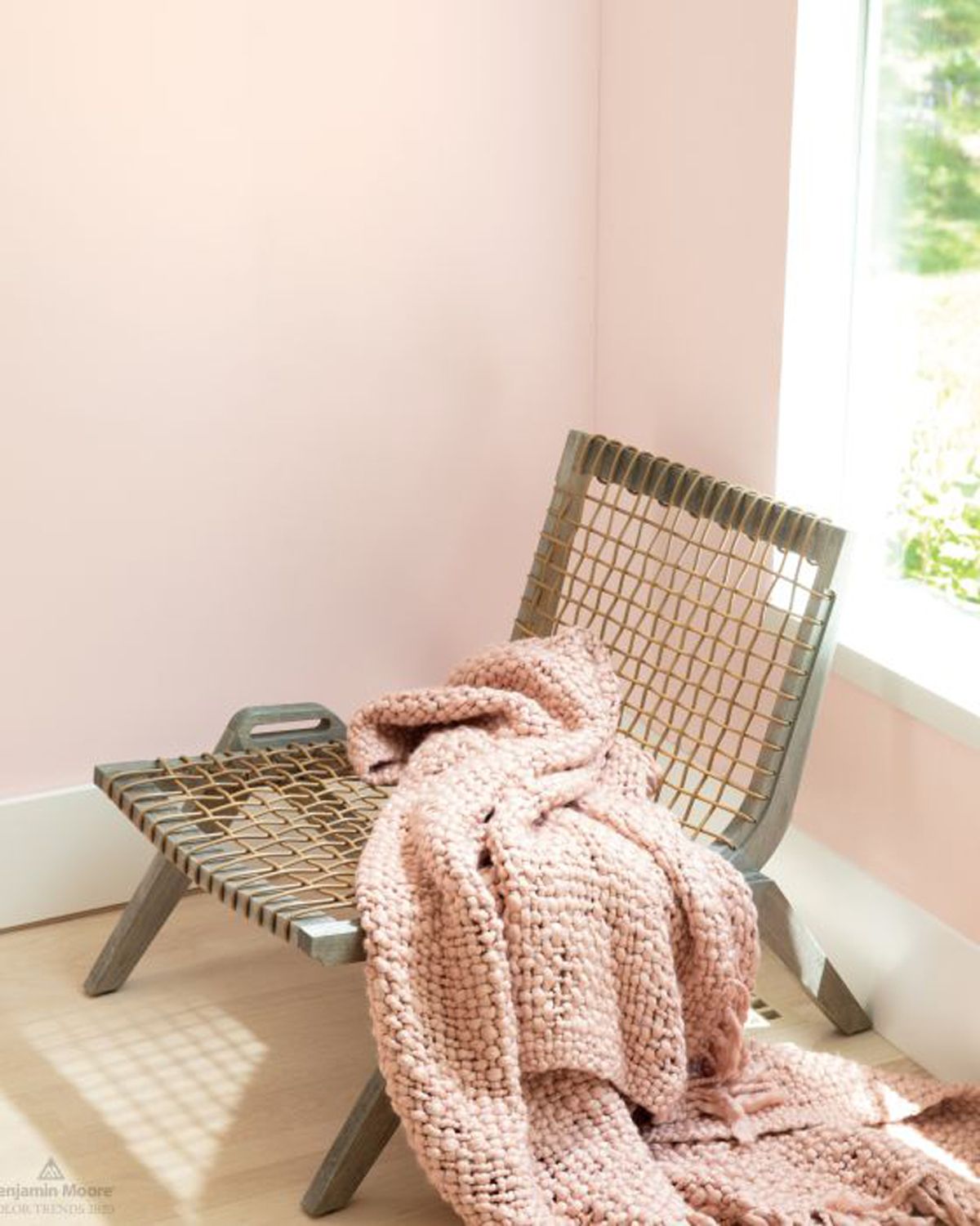
When an interior designer is faced with finding the perfect pink to suit all rooms, which do they choose? “I think Ballet Slippers is a pretty pink, without either too much blue or yellow in it,” says interior designer Libby Cameron (opens in new tab). “Used in an eggshell finish, it is a wonderful warm color for a bedroom with white trim.”
“Blush pinks look particularly sophisticated when used as a backdrop to contemporary materials like concrete and metal, and modern furniture design” adds Justyna Korczynska, senior designer at Crown (opens in new tab), who suggests that this shade would look at home alongside this year’s bathroom trends just as much as in a living room or bedroom.
“Combining blush tones with harsher, more industrial materials instantly softens a space. More exciting than white and not as intense as a neutral gray, blush pinks are the perfect middle ground.”
View Ballet Slippers Regal Matt Emulsion at Benjamin Moore (opens in new tab).
6. Highland Rose by Graham & Brown

(Image credit: Graham & Brown)
“I love exploring more classic and timeless shades of the pink color family and this hue has a silent yet stately presence when added to a room,” says Devin Shaffer, Lead Interior Designer at Decorilla (opens in new tab).
“Especially in smaller spaces such as powder rooms, dining rooms, and home offices. When clients describe their vision using words such as “soft, romantic, warm, moody, feminine, chic, Scandi, etc.” this is an instant go-to.”
View Highland Rose Matte Emulsion at Graham & Brown (opens in new tab).
7. Lille Pink by Graham & Brown
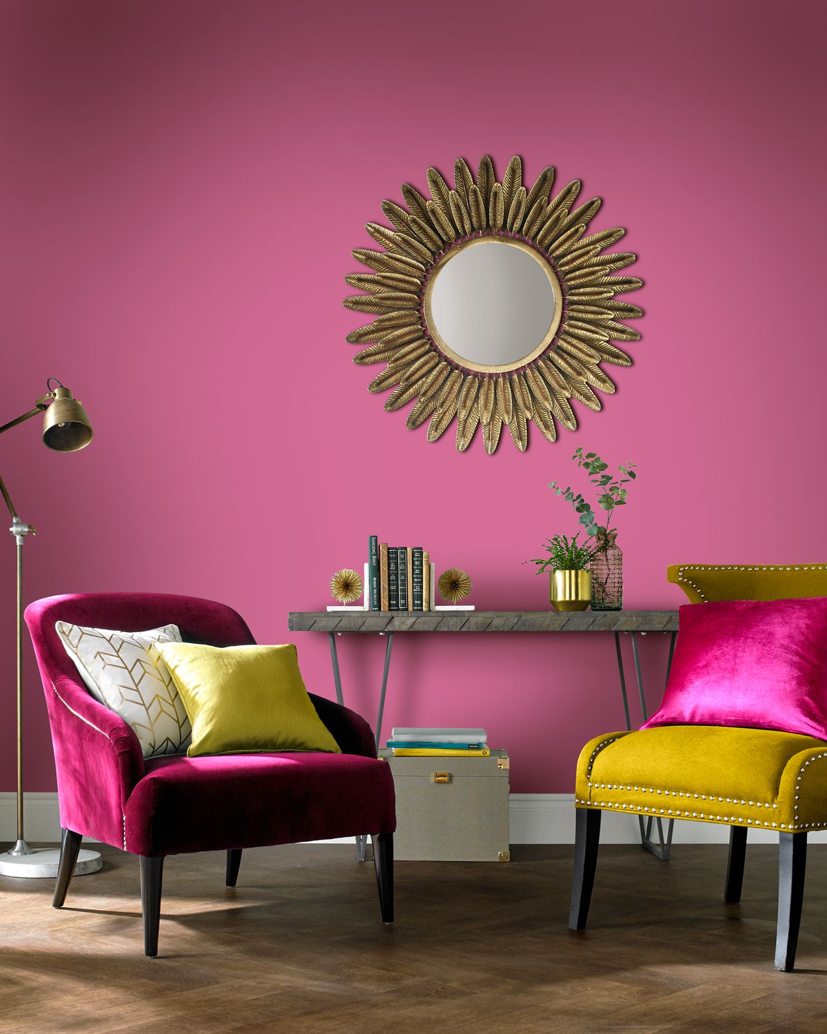
(Image credit: Graham and Brown)
“Lille creates a bold dramatic room and is perfect for the hot pink fashionistas out there” explains Head Stylist and Trend Specialist at Graham & Brown (opens in new tab), Paula Taylor.
Suggesting how and where to use this color in our homes Paula says, “Accent with bright jewel tones to create a fabulous maximalist feel. With the darker blue tones in this shade, I would use it in a room with plenty of natural light.”
View Lille Pink Matte Emulsion at Graham & Brown (opens in new tab).
8. Pink Ground by Farrow & Ball

(Image credit: Farrow & Ball)
“This paint color is absolutely gorgeous and a fun option for those who love pink. Its versatility is what makes it such a popular option” says Corban De La Vega, at Decor Matters (opens in new tab). “The pink is muted and provides a neutral color to your walls.” As you can see from this Farrow & Ball dining room, this shade of pink works perfectly with sage green.
“The brightness and warmth open up the space increasing the illusion of size and adding coziness. This option can be paired with so many different furniture items and colors, making it a relatively risk-free color for pink lovers.
9. Popsicle by Graham & Brown
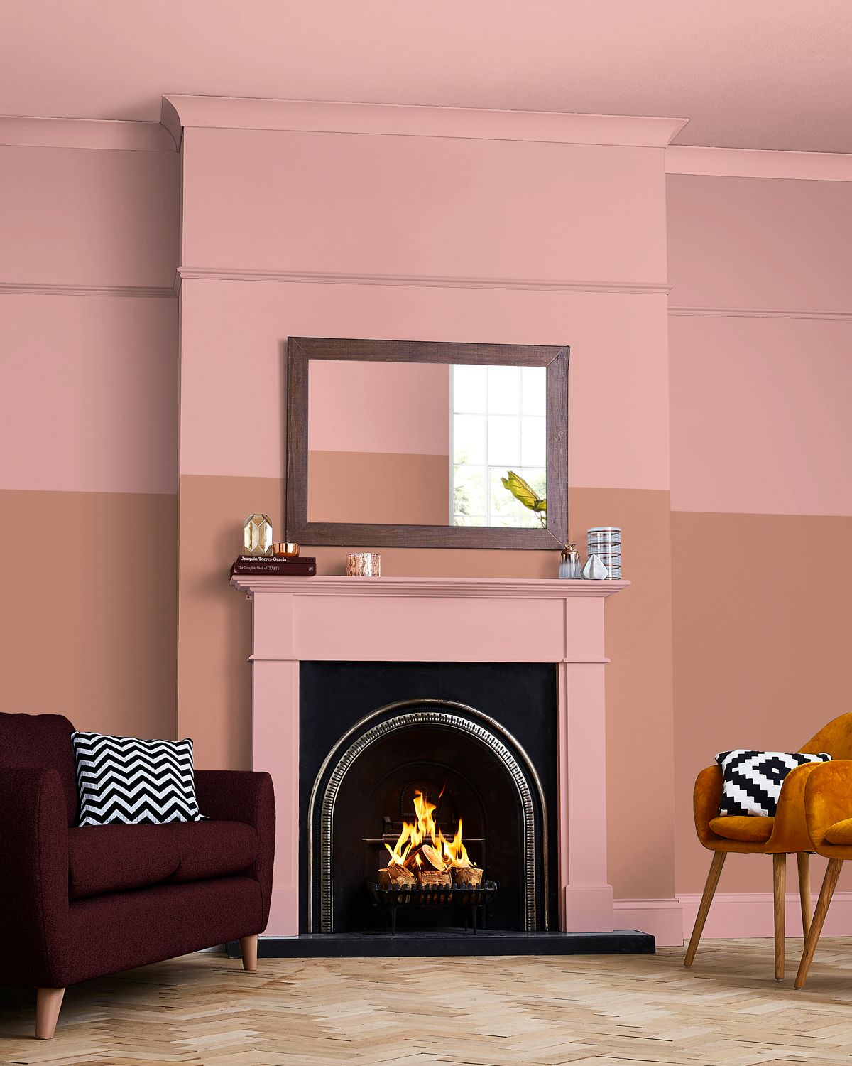
(Image credit: Graham & Brown)
“Popsicle is a good color match to Pantone’s Gossamer pink,” says Paula. “It is an uplifting shade that verges on the coral hue. Partnered with deep greens this color gives a truly tropical feel or paired back with neutral grays it can create a calming sophisticated room with an optimistic outlook.”
Suggesting where to use this lively pink paint color Paula adds, “As this shade has a dash of yellow it will brighten the dullest North-facing room.”
View Popsicle Matte Emulsion at Graham & Brown (opens in new tab).
10. Crème de la Rose by Crown
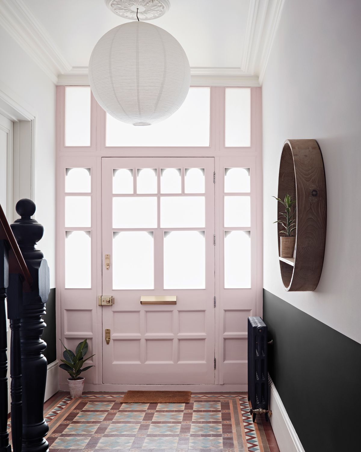
(Image credit: Crown)
This soft pink paint color is Crown’s best-selling pink, thanks to its versatility as a shade. “A lovely versatile, light, creamy, and soft pink Creme de la Rose is a quiet and unsaturated shade, it could be mistaken for a neutral but the red undertones exude a certain warmth,” says Justyna.
“The color suits all spaces; contemporary and traditional, it acts as a great backdrop shade for many colors especially deep rich blues and greens.”
“A blush pink can work in every room of the home. It adds warmth to a north-facing room but also looks clean and refined with the brightness of a south-facing one. An idyllic shade for matching existing furniture and soft furnishings, a blush or chalky pink provides the perfect backdrop to a room.”
View Creme de la Rose Matt Emulsion Paint by Crown at Homebase (opens in new tab).
11. Foggy Morning By Benjamin Moore
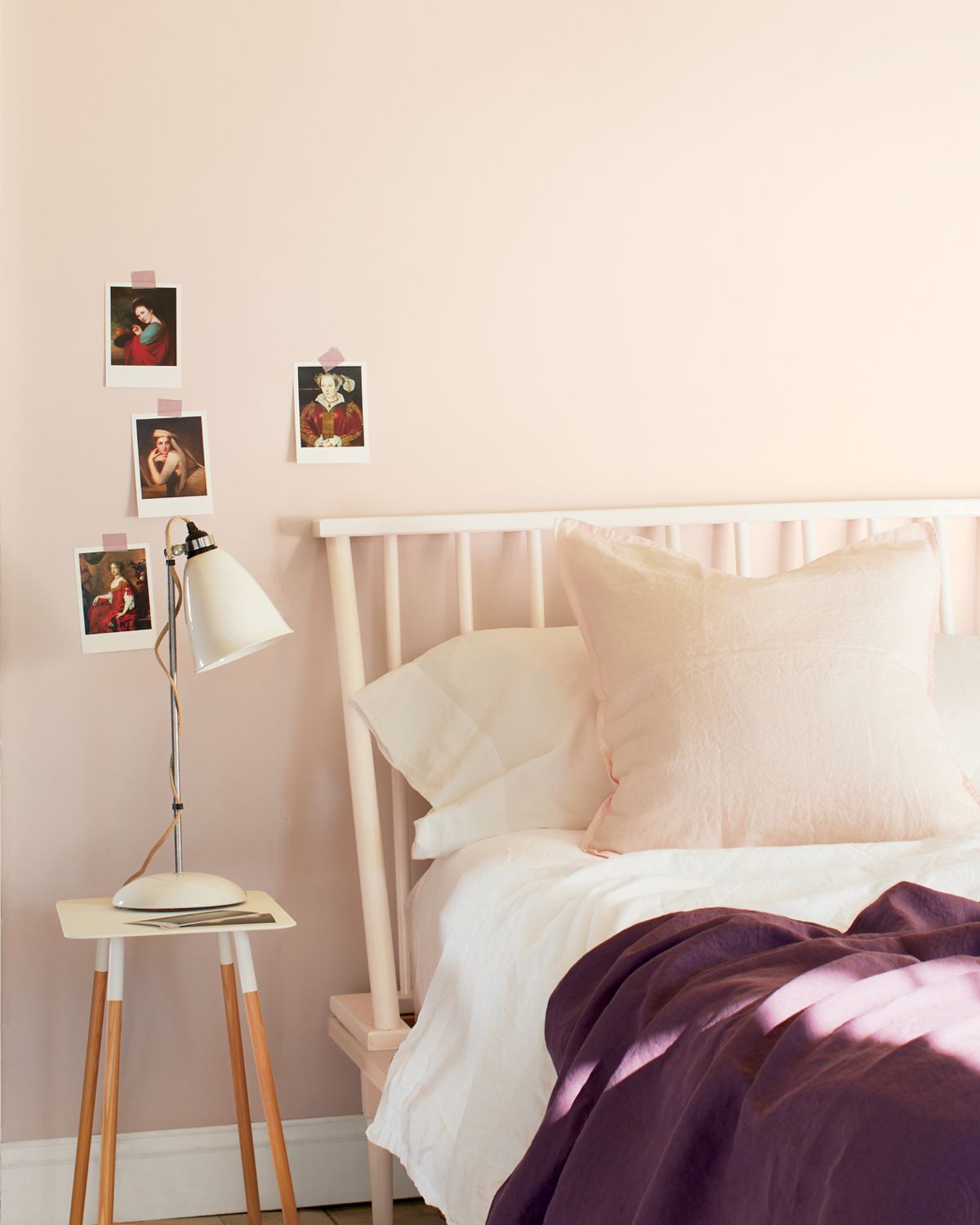
(Image credit: Benjamin Moore)
Benjamin Moore’s second best-selling pink is this calming pale color. “Foggy Morning is also a pale pink, but much more muted, so it appears almost like a neutral, with a red undertone in some lights and more of a pink one in brighter light,” says Helen.
“Understated and versatile, it works well in any room. Smoky, light, and delicate, Foggy Morning pairs well with violet for a sophisticated look, as well as Just Beige and Stone Harbor.”
View Foggy Morning Regal Matt Emulsion at Benjamin Moore (opens in new tab).
12. Dishy Coral by Sherwin-Williams

(Image credit: Future)
If you’re looking for a more nostalgic, peachy shade of pink this could be the one for you. “This shade of pink stands out and adds a refreshing feel to the space. It brings qualities of the ocean and beach, creating a sense of escape and peace” says Corban.
Sitting within the red ‘color family’ at Sherwin-Willams this pink tone is a saturated shade that is best suited to rooms filled with light to allow the shade to sing, rather than be damped by dark shadows.
View Dishy Coral Interior Arcylic Latex Paint at Sherwin-Williams (opens in new tab).
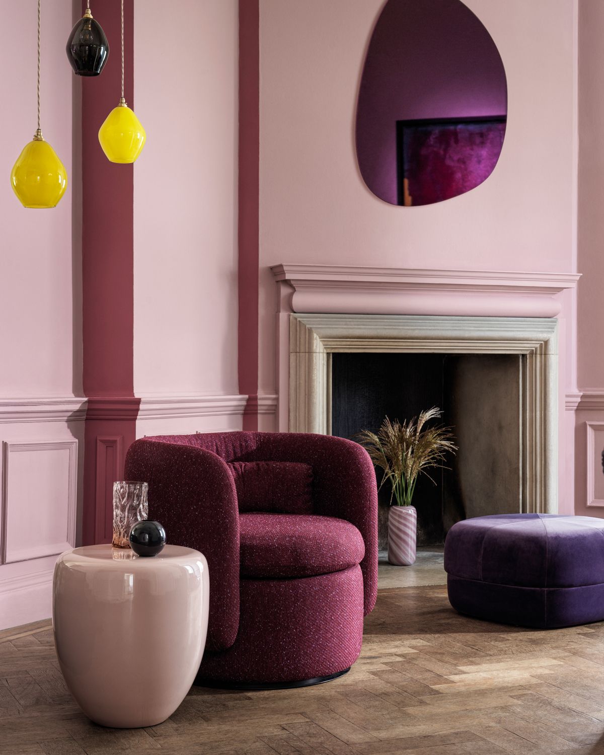
13. Cross Stitch by Crown
(Image credit: Crown)
“A mid-toned, muted rose that evokes a warm, comforting feel to any space. With its grayish/red hue, it’s an incredibly soft shade that is easy to live with and which suits all spaces” says Justyna.
“It will look richer and more vibrant in low-level artificial light. It’s particularly great for North-facing rooms to create the illusion of warmth. For a soft tonal contrast, pair with Quiet Space, or Soft Scribbles. Inject a sense of energy with pops of color in furnishing in similar colors to Rustic Twine or Ceramic Kiln.”
View Cross Stitch Matt Emulsion Paint by Crown at Homebase (opens in new tab).
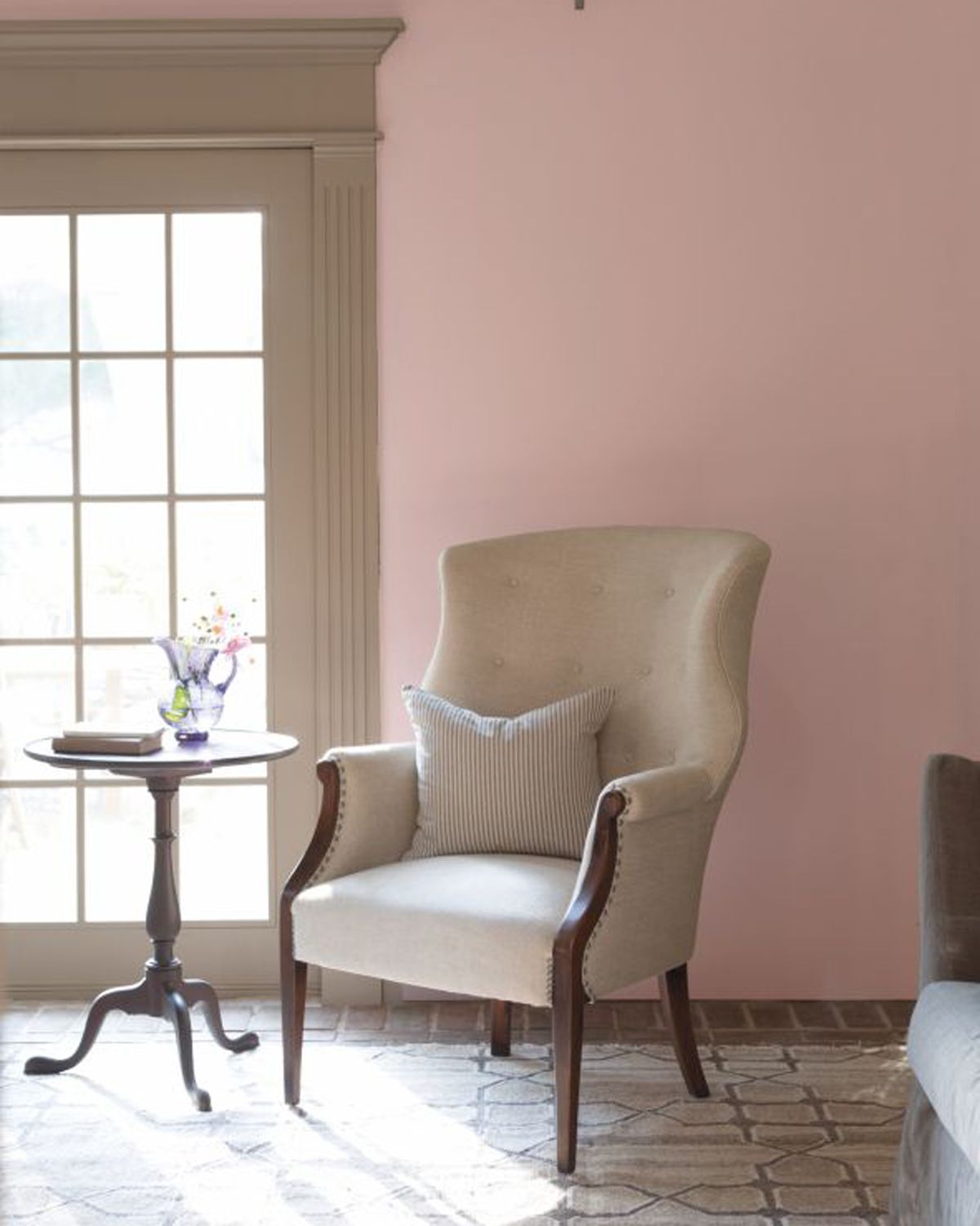
14. Pink Dynasty by Benjamin Moore
(Image credit: Benjamin Moore)
“This color is the perfect combination between a bold and muted pink. It is not too much and not too little” says Corban. “We love seeing this color in the bathroom, kitchen, and living room.”
“It adds a perfect splash of vibrance and youth to the room without overdoing it. We see this color on kitchen cabinets often, and it creates a unique kitchen space.”
The introduction of pink paint colors is huge in kitchen trends in 2023, and this soft shade is ideal for those looking for a gentle approach using this trending shade in the heart of their home.
View Pink Dynasty at Benjamin Moore (opens in new tab)
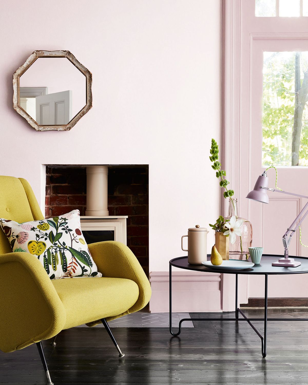
15. China Clay by Little Greene
(Image credit: Little Greene)
This subtle shade is so muted it’s almost not pink, perfect for those wanting to add extra warmth and use an alternative to the best white paint.
“For a softer option, ‘China Clay’ is a wonderful alternative to white and this gentle, almost neutral, pink delivers just enough warmth to a space,” advises Ruth.
“For a dramatic contrast, pair with a rich and regal aubergine such as ‘Adventurer’,” she suggests.
View China Clay Absolute Matt Emulsion by Little Greene at Designer Paint (opens in new tab).
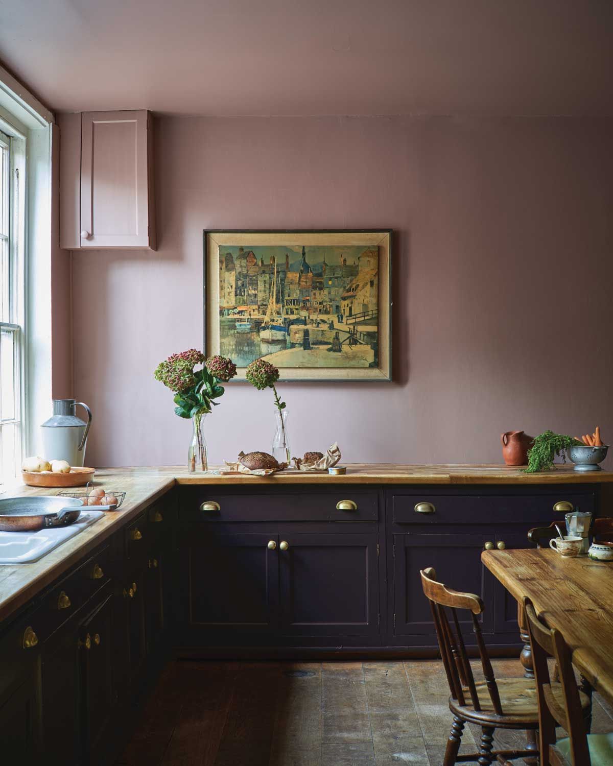
16. Sulking Room Pink by Farrow & Ball
(Image credit: Farrow & Ball)
I personally have this delicious shade of pink as my kitchen paint color. The room was a pastel pink colorway before but as a room that is flooded with natural light it always felt a bit too wishy-washy, I wanted a deeper shade that would hold its own in a bright environment.
Sulking Room Pink is the perfect hearty pink tone that feels like a pigment derived straight from the earth, ideal for those who want to use a warming tone without going overtly pink. The pink paint looks almost brown when it’s first applied to the wall – but don’t be alarmed, it dries to a deep chalky tone of muted rose that oozes sophistication.
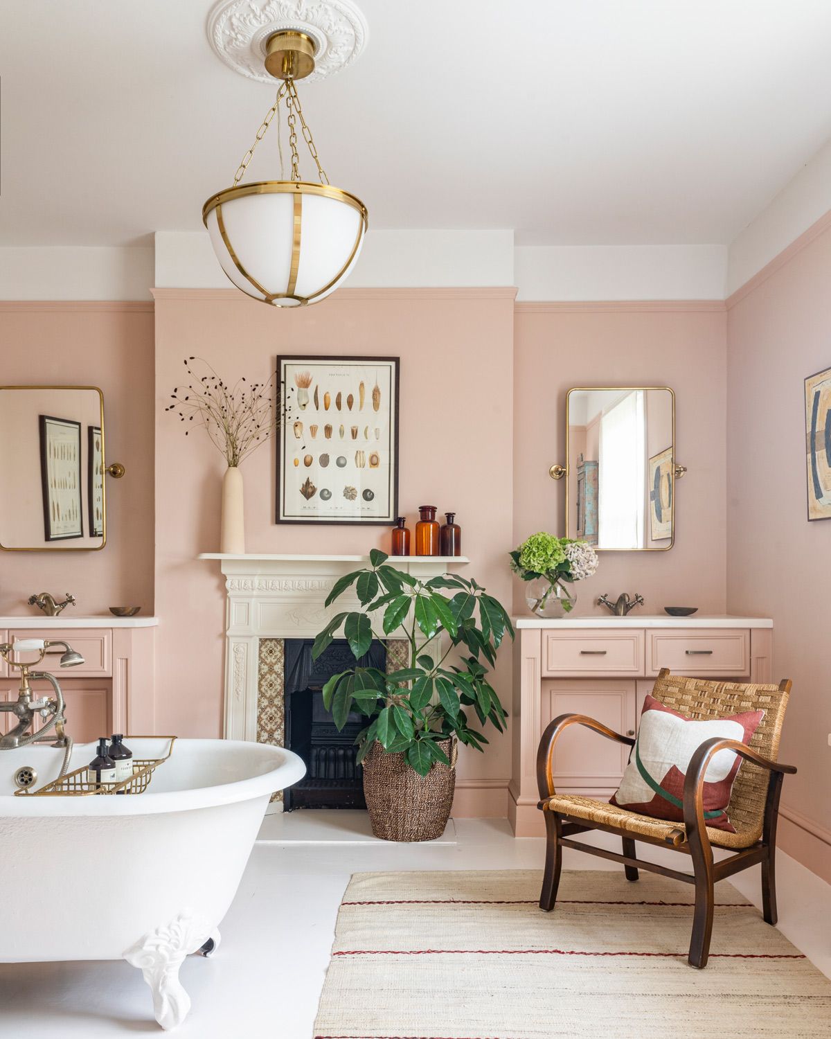
17. Cuis de Nymph Emue by Edward Bulmer
(Image credit: Edward Bulmer | Andrew Steel)
“I love Edward Bulmer’s ‘Cuis de Nymph Emue’,” says interior designer Naomi Astley Clarke (opens in new tab). “It’s a wonderful neutral pink that works so well in both town and country.”
Advising on where to use this dusky pink shade Naomi says: “think about how much light your home receives. In a darker area, avoid deeper neon or bright pinks as these will feel dominating. Consider coral or plaster tones for a darker space which will help to uplift the scheme.”
View Cuis de Nymph Emue at Edward Bulmer (opens in new tab)
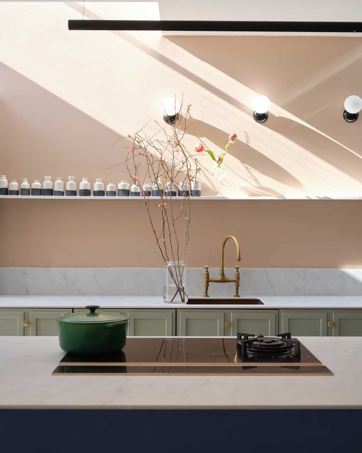
18. Templeton Pink by Farrow & Ball
(Image credit: Farrow & Ball)
“Templeton Pink is a warm shade with a distinctly historic feel,” says Charlotte Cosby, creative director at Farrow & Ball.
“A hint of yellow pigment lends it to north-facing spaces, as it can bring some much-needed warmth and coziness to darker rooms that can risk feeling cold. Templeton Pink also adds a touch of comfort and coziness to a kitchen.”
What colors work well with pink?
Pink is an ideal wall color for those looking to add accent shades because it works so well with all other hues. This versatile color, with its range of depth of saturation pairs with pretty much every other color within the color wheel.
Pink is particularly good paired with green, from mint green to forest green it is always a winning color combination. “I love pairing pink and green,” explains Justyna “there’s something incredibly fresh and soothing about this combination.”
“Pink and green are opposite on the color wheel, so they create a beautiful contrast that’s still very easy to live with. Deep green adds a modern, edgy element to soft blush pink, perfectly balancing the scheme while creating a sophisticated look.”
In terms of adding color accent via material and surfaces, in a kitchen, for example, Naomi advises: “I love to pair antique brass hardware with pink. Gray works beautifully with pink too, as well as honed Carrara marble.”
[ad_2]
Source link